
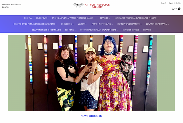
ART FOR THE PEOPLE
Art for the People is an Austin, TX-based art gallery founded by Deanna Worden. The gallery also includes a retail space for local artists to sell their creations. For this spec project, I was tasked to improve their e-commerce user experience for a certain type of user, The Deal Diver, and to keep the local feel of the online store. My role in this two-week sprint was the Principal UX Designer and I used Figma to complete the project.
pluses + deltas
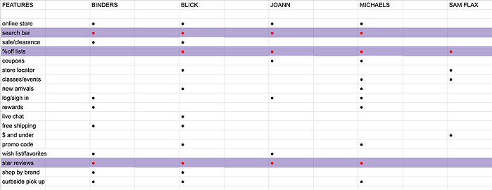
I started the Discovery phase of the UX design process with a feature inventory which is a comparison of features included and not included in each competitor's site. Highlighted in red are the most common features all competitors possess. While search bars and star reviews are very common features among e-commerce sites, what I found most interesting was that %off lists were found in 4 out of 5 competitors, but they were all scattered throughout the site and not part of the navigation of the actual site.

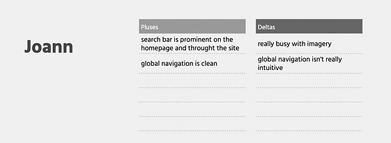
I did further competitive analysis through Pluses and Deltas, which is basically the "pros and cons" of competitor's websites. I wanted to compare some of the features and characteristics of e-commerce sites in hopes of applying them to the e-commerce experience for Art of the people. I gathered that the big-box retailers have really busy imagery, and jarring color schemes, so I kept that front of mind for my user and the feel of Art for the People's e-commerce site.
DEFINE


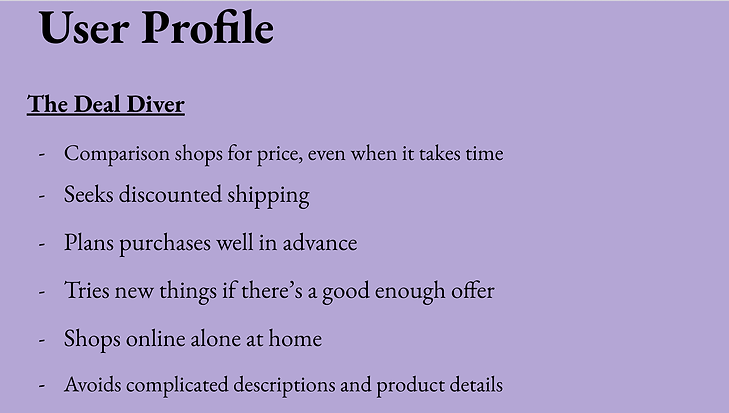
In the define phase of the UX design process, I want to paint a better picture of our specific user, The Deal Diver. By pointing out these behaviors above we can better understand our users and how to elevate their user/e-commerce experience.
I interpreted what I gathered about our specific user's behaviors and came up with a Problem Statement, which is like a hypothetical situation as to what our users are trying to solve or the pain points they are facing. This then brought me to How might We Statements, questions as to how we may solve our users' pain points.
user flow

So, after the competitive analysis and discovering the lack of percent-off lists pretty much across the board and the needs for The Deal Diver, I came up with a user flow, which is how a user moves throughout a task within a website, for Art for the People's e-commerce site that includes a percent-off list feature in the navigation of the site. This user flow streamlines finding the best offers within the navigation rather than the percent-off lists popping up randomly like they were in the 4 out of 5 sites used in the previous competitive analysis.
sketches
TITLE OF THE CALLOUT BLOCK


After establishing a User Flow for our user I took to pencil and paper and sketched out how that User Flow might look on screen. For this spec project, I was instructed to start with a mobile platform first. What you're looking at right now is how the user enters the site on the home page and is immediately given the option of the percent-off lists in the global navigation. Then the user moves through the next screens that include the percent-off lists, then the items that are are a certain percent off, then through the checkout process.

wireframes
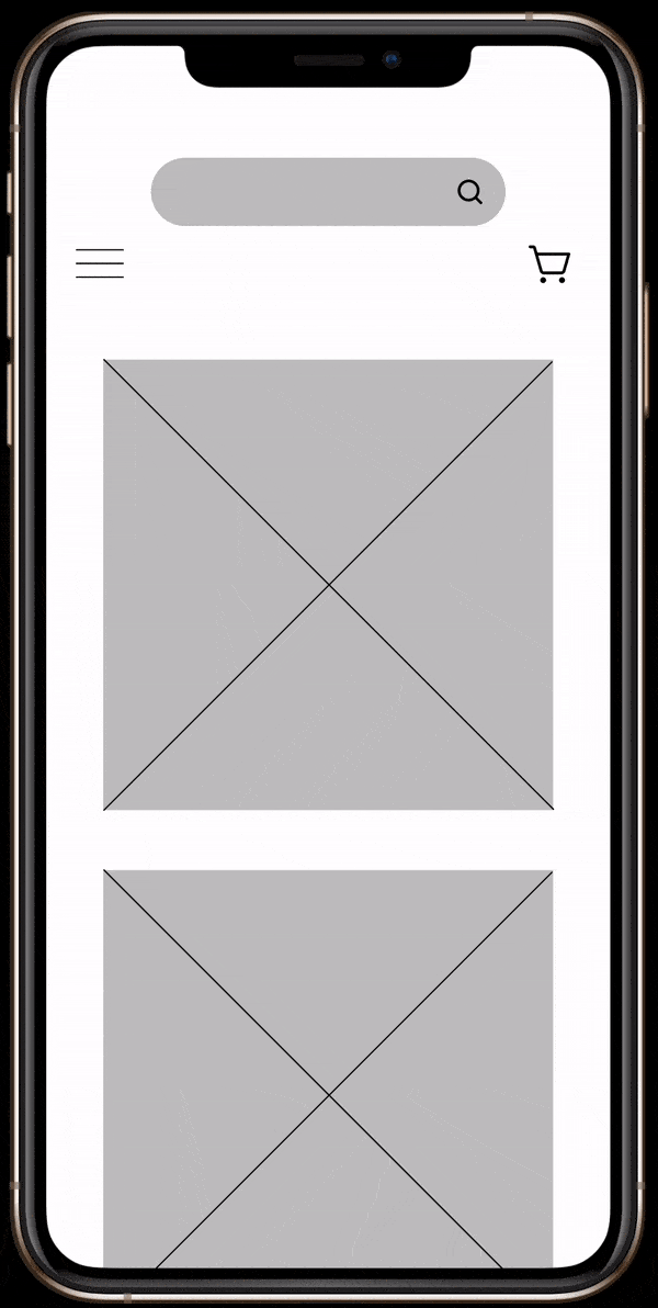
With the initial sketches done I then took them to the next phase and that was to make them digital and used Figma to build out Wireframes, basically digital renderings of the sketches I made. Once the Wireframes were complete I then linked them all together to create a mid-fidelity or not-so-quite done prototype to have for usability testing. Here once again, we see the user going to the percent-off list option from the main navigation and going on to the percent-off list screen.
DELIVER
usability testing + next steps

After I completed my Wireframe prototype I then took it to be tested amongst three users. The users were tasked to find the 25% Albrecht pencils and complete the checkout process within two minutes. All three users were successful in completing the task which was great.
Although all three users completed the task within the time limit there was still some feedback left by some of them. One area for improvement was within the percent-off lists screen and how the font was difficult to read.
Another area for opportunity was the navigation for the categories, specifically for the percent-off option. One user claimed that its placement right next to the clearance category was confusing, seeing as the percent-off items are not leaving inventory permanently, but are solely just on promotion. I moved the percent-off category up the navigation to clear up any further confusion.

high-fidelity prototype
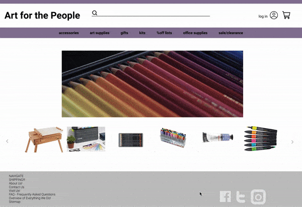
I listened to my users and developed a high-fidelity prototype made for the desktop version of Art for the People's e-commerce site. The percent-off category is centered in the global navigation to avoid confusion with the sale/clearance category. The percent-off list page is marked clearly with a bold font, but still in a nice grey color so as not to be too jarring like the competitors' color choices.
I'm a paragraph. Click here to add your own text and edit me. It's easy.