
SOUNDHOUND
Soundhound is a web-based music-identifying app made by the company Houndify. The app sets itself apart from other music-identifying apps with its feature to be able to hum a song to identify it. We were tasked in this spec project to develop a new feature in the already existing app. My role was one of the User Researchers and the tools used to complete the two-week sprint were Miro and Figma.
MEET THE TEAM

Anna Christine
UX Design + Research

Frederick Hahn
UX Design + Research

Gloria Oh
Project Manager +
UX Design + Research
DISCOVER
user survey

We kicked off the Discover phase in the UX Design process with initial User Surveys. We did this for two reseasons, honestly. One reason was to find valid candidates for user interviews and the other reason was to gain more insight into this app because the three of us had never even heard of Soundhound before this project.
Some questions asked during User Interviews:
-You mentioned in your survey that you like to use apps to identify and listen to music. Which ones do you use?
-How many times a week do you find yourself using music apps?
-What features do you use in the music apps?
-What makes an ideal music app experience for you?
user interviews
Some insights gathered from the user interviews included one user who uses Shazam solely for identifying music. The user also exclusively listened to music through apple music premium and uses Spotify less frequently.
The user used Shazam about once or twice a week, Apple Music premium 5-6 times a week, and Spotify maybe only once a month. Their frequency with Apple Music premium changed according to their job and being able to listen to music while at work. Their sporadic use of Spotify comes from only using it to listen to playlists someone would send them from Spotify.
When asked what features the user uses in their music apps they like to use the playlist, browse, and suggested music features. The user would also listen to suggested playlists as ambiance, music for a party, or just want to listen to something and not get incredibly specific as to what music is playing.
The ideal music app experience for one of our users was one with no interruptions i.e. ads and streaming issues. Easy ability to create playlists and be able to listen to music in a variety of places (phone, TV, laptop).
The user also enjoys a wide variety of music and having access to anything they want to search for.
DEFINE
user persona

Our user persona, which is basically an avatar of the user you are designing for, was based on the information we gleaned through user interviews and the feature we would like to add to the Soundhound app. Some of Cassie's goals are to search for music and make playlists with her searches. Cassie would also like more functionality like Spotify's playlist sharing feature..
problem statement

Now that we have a better understanding of who our user is and what their personality, behaviors, goals, and pain points are we can now solidify the problem statement. The problem statement we came up with for our user gives us a jumping-off point towards designing a solution for our user and the new feature we have been tasked to design for Soundhound.
user flow

Here we have our user flow that shows how they would navigate through the app to accomplish a certain task for our user. The user would open the app and would search for a song, select a song from the results that they like, and would then decide whether to make a new playlist or add to an existing playlist.
In this case, our user would be making a new playlist, naming it, and getting confirmation that the song has been added to her new playlist. They would then go to that playlist, and then share that playlist externally through social media like Instagram, Facebook, and Twitter.
Although we found this user flow a great way to showcase the search and playlists features we also found that this user flow was not adding a new feature to the Soundhound app.
affinity mapping
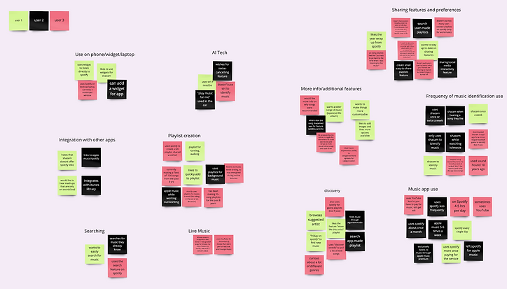
Realizing that our user flow was not actually adding a new feature to Soundhound we referred to our affinity map, used to organize ideas and data to come up with trends amongst the information gathered from user interviews. One trend we saw that had quite a few post-its was the "sharing features and preferences" category and we decided to focus on that.

user flow - take 2

sketches

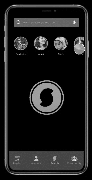
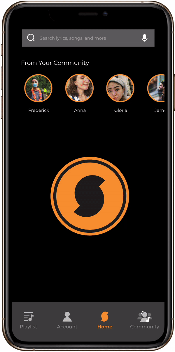
Now that our focus had shifted to music sharing features we decided to add a new community feature Soundhound. The new user flow would have the user clicking the community icon from the home screen, browse a friend's playlists, find a song they want to add to their playlist, add it to the new or existing playlist, confirm and listen to that playlist.
Another goal of ours with the new community feature was to keep the user within Soundhound.

Here are my initial sketches for the new community feature in Soundhound. The sketches show how the user enters from the home screen and clicks the community icon. The second sketch shows the user landing on the community page where they would select a friend. The third sketch shows the user on the selected friend's page with their friend's playlists listed.
The user would then select a playlist, finds a song from the playlist, and add the song to a playlist. The user would then decide to make a new playlist and add the song to the playlist. the last screen shows confirmation that the song has been added to their playlist.

wireframes


Here are my initial wireframes. The first shows the new home screen where I moved the navigation towards the top of the home screen and added a community icon. The user flow is the exact same as the sketches showed previously.


DELIVER
usability testing
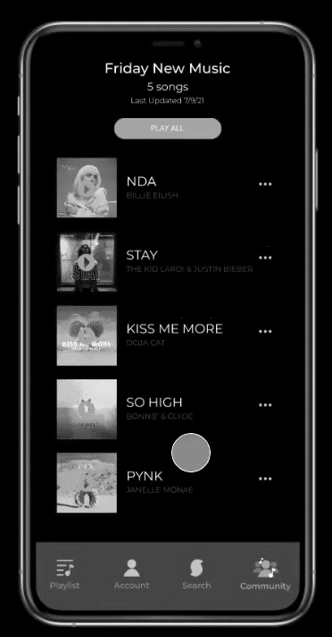
From our wireframes, we created a mid-fidelity prototype we used for usability testing. The user was tasked to first go to their friend Frederick's playlists. Then the user had to pick Frederick's latest playlist and pick the Billie Eilish song. Finally, the user would add the Billie Eilish song to a new playlist and listen to that playlist.
This image is showing us how the user was completely missing the community icon and going to Frederick's friend page from the home screen.
One pain point we found during usability testing was users were having trouble. We addressed this pain point by replacing the share icon with an add icon because the original share icon was for external applications and we want to keep users within Soundhound with our new community feature.
From our iterations, we changed the pull-up menu order as well. We moved the top share button down and moved up "add to playlist" and "add to favorites" to the top.
hi-fidelity prototype
next steps
With the hi-fidelity prototype done some next steps the team talked about would be to rebrand to align with Houndify's company website and their other website, Hound. Another next step would be to incorporate a messaging feature within the Soundhound community. One other next step would also be to incorporate a "subscribe to playlist" option like Spotify premium.