Timeline
3-week sprint
Timeline
3-week sprint
My Role
UX Researcher
Visual Designer
UX/UI Designer

Tools
Figma
Adobe Photoshop
Google Suite
Miro
Deliverables
UX Research
Product Design
Interactive Prototype
OVERVIEW
Our client was in the final development of a desktop experience: My Afterlife.
My Afterlife allowed users to create end-of-life plans, organize final wishes, and store important financial documents, wills, and written life stories. The desktop service was offered in three subscription tiers at various prices.
THE CHALLENGE
Going over the project scope and KPIs, we learned their team wanted to offer additional value and more incentive for the top-tier subscription cost. The desktop experience currently did not allow any photo or video uploading, something we saw as a major opportunity to accompany the service.
We concluded the most effective strategy was to design a complementary mobile experience that would add to the overall product value.
GENERATIVE RESEARCH
To kick off discovery, we sent out a survey to 25 users to gauge overall interest in the idea. We selected people who had close families and an interest in their heritage. From the responses, we found that most people felt the app would appeal to users ages 40–60 with others not far behind.

76% of people stated they were interested in using the product, which encouraged us to keep moving ahead to further discovery.
We conducted in-depth interviews with ten target users ages 30–75. We gathered specific info on what memories people save, how they organize keepsakes, and what they do to memorialize a passed loved one. We also learned what platforms they used and how they shared their photos with others.


Using direct quotes, our team created an affinity map that grouped data into valuable user insights such as
media organization, security, competitor products, family discovery, memory making, and user needs.

COMPETITIVE ANALYSIS
DIRECT COMPETITORS
We then did competitive research in the end-of-life planning and memorial industries. Looking at ten similar companies’ desktop and mobile experiences, we discovered where we could further add value and innovate with new features. Many companies focused on the solemn planning aspects of death and grief, such as the examples below.


Many competitors didn’t support media uploads or saving to the platform. Others lacked a mobile experience or in-app recording, making it even harder for users to access their media in one location.

None of our competitors offered the ability to create photo albums or curate life stories–– a feature we saw as a major opportunity.
INDIRECT COMPETITORS


We also analyzed indirect competitors who catered to older demographics.
Researching interface design standards for the elderly, we considered font and button sizes, contrast levels, tutorial or help functions, dexterity issues, and concise UX writing.
USER PERSONAS


The team created Lisa as a persona to represent what the account owner might be like. We discussed how compiling a person’s life digitally would be quite an undertaking, and how the account holder (who’s likely a little later on in life and not as tech-savvy) might be relying on other family members to collaborate on this effort. And what a bonding experience that is!
Because Lisa might not be very tech-savvy, the primary user for the mobile app we’ve designed would be someone like Lisa’s daughter Michelle, described below.
PROBLEM STATEMENT
MICHELLE NEEDS A WAY TO CELEBRATE AND CONTEXTUALIZE HER MOTHER'S LIFE SO THAT SHE CAN KEEP HER STORY ALIVE
FOR FUTURE GENERATIONS
HOW
MIGHT
WE...
- MAKE THE TASK OF COMPILING A LOVED ONE'S MEMENTOS LESS DAUNTING
- AID MICHELLE IN CONTEXTUALIZING THE ARTICLES OF HER MOTHER'S LIFE
- ENABLE MICHELLE TO SHARE MEMORIES DIGITALLY WITH HER CLOSE FRIENDS AND FAMILY
THE SOLUTION: LEGACYBOOK
Once the solution was clear we began ideating. Most of our surveyed users store photos on their phones, so we knew the best route was to design a complementary mobile app that would connect to the already existing desktop experience of MyAfterlife.
Legacybook would preserve the account owner's legacy by curating and sharing their life moments. Invited collaborators can add content or leave comments on their stories creating a digital scrapbook where families can create, collaborate, and celebrate the life of their senior loved one together.

This chart represents the user hierarchy for Legacybook. The account owner designates designees and designees can invite other family members and friends to also be collaborators.
IDEATING FEATURES
DESKTOP
EXISTING SITE
Account Owner - Grandmother ( Lisa)
Store and transfer account holder's secure legal documents
LEGACYBOOK
MOBILE APP
SUPPLEMENTARY APP
Designee - Daughter (Melissa)
Preserve account holder's special mementos & memories
MAPPING USER FLOWS
The team assembled to discuss our research insights and honed our focus on three features at the core of our new mobile application. We resolved that these three features would best serve our persona's needs in digital scrapbooking within Legacybook: Adding media, viewing stories, and adding/viewing stories.

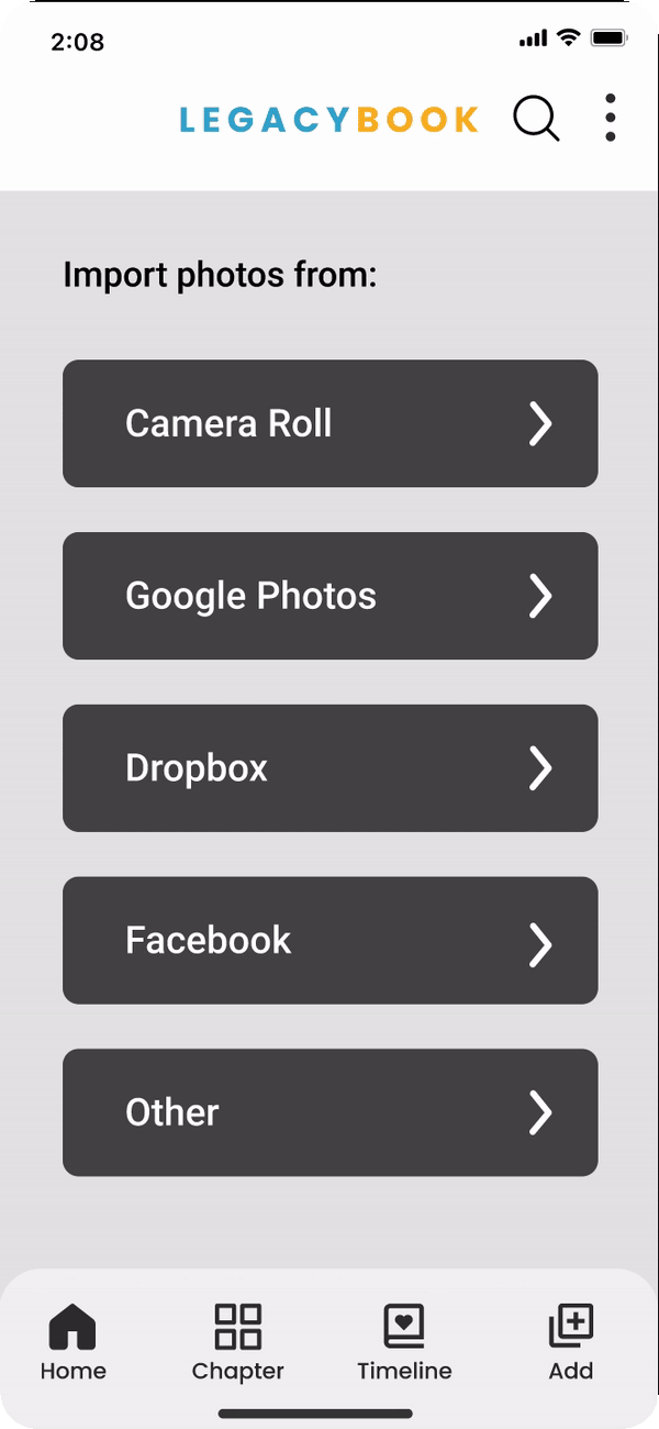
Add Media Flow: This flow enables users to add media from their phone’s camera roll, Google Photos, and other file storage applications. It also gives the user the option to capture media in the form of audio, video, photos, or documents (like grandma’s recipe or a handwritten letter).

View Story Flow: Chapters operate much like albums in that they would allow users to organize photos of the account owner’s life. It was a UX writing decision to call this feature 'chapter' instead of 'album' to fit the book theme of the app. For each chapter, users could add descriptive information such as a date, location, or comments to media.

View Chapters Flow: In this part of the app a user is able to see all of the chapters collated into a timeline of the account owner’s life. There are options to change the way this media is displayed in a story format (where sections can be reorganized), as well as in a slideshow format.
EXPLORING SKETCHES
Our team created wireframe sketches based on the established user flows. Our goal was to create an experience that allowed users to upload, organize, and share their memories of various types of media: photos, video, audio, or scanned keepsakes such as old letters or recipe cards.
Our team created wireframe sketches based on the established user flows. Our goal was to create an experience that allowed users to upload, organize, and share their memories of various types of media: photos, video, audio, or scanned keepsakes such as old letters or recipe cards.


Describe your image

Describe your image
We knew our competitors lacked intuitive content organization.
Because we were working with an entire lifespan of content, we took careful consideration into how the sections and timeline areas were presented.
LOW-FIDELITY WIREFRAMES
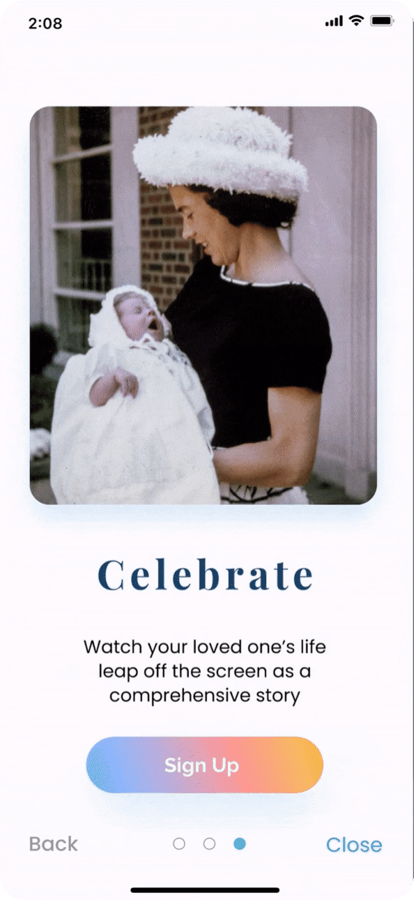
ONBOARDING
Because we are introducing users to a new vocabulary of chapters and stories we decided to begin the users' journey with an onboarding process.
We began onboarding by taking the user through staged flows of our three primary features: Adding Media, Chapters, and the timeline view of the story.
HOMEPAGE
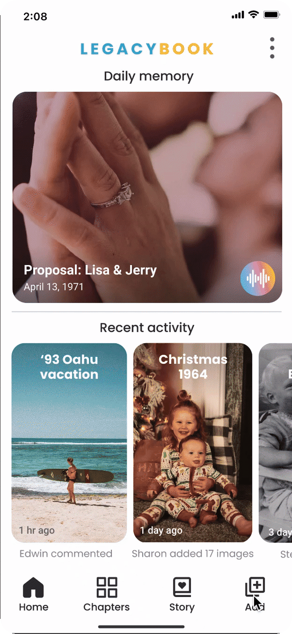
User research guided us to the insight that users find joy in learning new information about family members.
In an effort to aid the discoverability of these sorts of moments we tested a "memory of the day" section of the homepage. Picked from random media imported into the app, we hoped users would be receptive to this element.
Another part of the homepage displays the most recent activity of all users of the account. We felt this would help users engage in collaborative dialog and replicate that feeling of opening an old photo album.

LOW-FIDELITY USABILITY TESTING
USABILITY TESTING: ROUND 1
Your mother invited you to be a collaborator on her Legacybook account where you can upload memories and invite friends and family to contribute to your mother's story.
TASK 1
-
onboard yourself and view the story
TASK 2
-
upload content and add it to a new chapter
TASK 3
-
in the "Marriage" chapter, edit the description and view the comments
LOW-FIDELITY USABILITY TESTING RESULTS

TESTING RESULTS
USERS AGES 30 - 63
-
5/5 users reported cluttered interfaces
-
3/5 users wanted improvements to "add media" user flow
-
3/5 users were concerned about transparency and privacy
-
5/5 users requested revised UX writing in the footer
*Footer version 1

CREATING A STYLE GUIDE
Equipped with great data from first-round usability testing to iterate, we prepared to bring our prototype to high fidelity.
This began with each team member creating a mood board of UI inspiration based on our client's desire for a more cheerful and ethereal feel.


We held another Design Studio and once we met and discussed where our mood boards overlapped we began to synthesize our agreed-upon elements into one master Style Guide.
STYLE GUIDE

Initially, our survey informed us what colors people associate with the subject matter of memorializing senior family members. Our competitors echoed the responses of using blues, neutrals, and earth tones.
We didn't agree that those muted color palettes reflected the core value of Legacybook; that lives are meant to be celebrated!
Our response was to employ sunset colors and affable fonts to inject a comfortable and approachable feeling toward a usually somber subject through a warm, colorful user interface.
USABILITY TESTING THE COLOR PROTOTYPE

USABILITY TESTING - ACCESSIBILITY
*Original image

*Simulated red/green colorblind image

We learned from research that users of the older part of the demographic might have difficulty with the contrast ratio in our color palette as developing abnormal color vision increases with age.
We were fortunate in our usability testing to acquire a user aged 50 with deuteranopia (red/green colorblind deficiency) in our second round of usability testing.
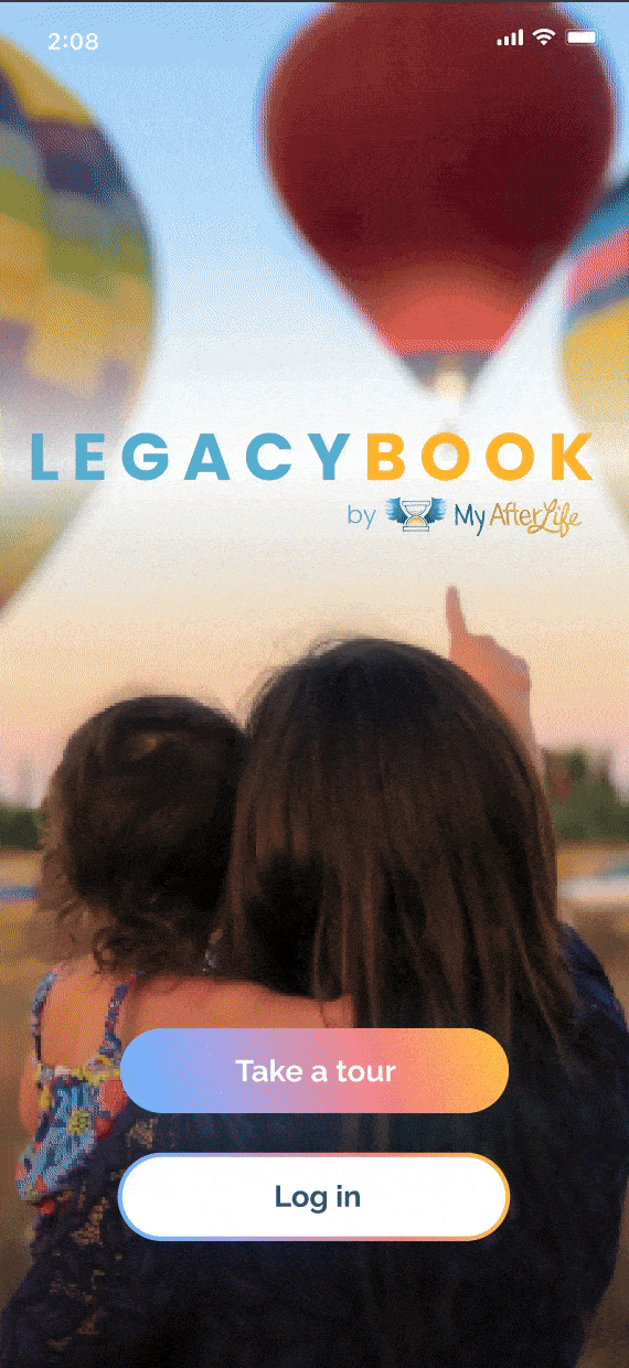
The hero image on the initial screen did not stand out to them. The user knew the hot air balloon was red because it looked to them as the "usual pumpkin pie color" and the hair on the people in the image blended together to them.
There were no further flags for accessibility during the test, and the user was able to successfully complete all tasks. They stated the contrast was sufficient for them to know where to tap to accomplish their goals.
HIGH-FIDELITY PROTOTYPE
NEXT STEPS
Throughout this project, I learned a lot about client relations, from setting expectations, to getting buy-in on design directions, and especially how to pivot and work through design directions and decisions.
Getting to work with a team with such diverse backgrounds and their strengths used towards all of us achieving the same goal was definitely my favorite part of this project!
REFLECTION
Throughout the design process for LegacyBook users expressed that it would be a product they would have an interest in which felt like such a great success to the team. Of course there were features we would still like to further iterate on within this project as there is much more that we would love to do to refine and enhance the user experience. For example:
-
Elaborate the relationship between MyAfterlife and Legacybook
-
Integrate 3-D mementos such as jewelry and artwork into the app's experience